|This original article “FC Future Business” by Chen Hongru was published on February 25, 2021.
As far as physical stores are concerned, storefront style, product display, orderly arrangement, and ease of access to products will all affect consumers’ purchasing decisions. Relating that to e-commerce shop platforms, it is the legibility of website pages, browsing and shopping flow of the website interface, and etc. that improve consumers’ willingness to place online orders. Thus, these details of your e-shop website must be designed with thought and care.
However, many stores tend to want to take all their products online when they are transitioning into e-commerce. Now imagine this, a new customer visits your e-shop for the first time and finds something he/she likes after spending a while browsing around on the website but ends up being unable to place the order. Unlike shopping at a physical store where he/she can immediately inquire with the store staff, such an “unsmooth” website user experience may very well increase the bounce rate or simply result in order dropping. This is a significant pity for e-commerce companies who already have relatively high costs from growing their customer base.
However, what kind of an online shopping platform makes people feel like they can’t help but want to place an order? We can take the case study from American retailer Bandier’s website redesign to examine how Bandier managed to revive their business in this highly competitive e-commerce market.
Personalized marketing to increase customer conversion rate
Bandier, an NYC-based women’s clothing retailer founded in 2014, mainly sells casual wear and activewear. In addition to an e-commerce platform, Bandier also has 6 physical stores carrying over 50 well-known brands, including Adidas, Nike, and a pool of budding designer names that continue to grow. Lisa Donnelly, Bandier’s VP of E-commerce/Product, pointed out that the thousands of products listed on the platform can really overwhelm consumers.
In order to break through this sales dilemma, Bandier started working with the e-commerce platform Nosto over the past six months, striving to give customers a better shopping experience. One of the biggest shifts in enhanced shopping experience was through personalized shopping recommendations.

Figure 1. Bandier overcame the sales dilemma through website redesign
In the past, Bandier, like most other e-commerce websites, provided all consumers with the same product recommendations. Although these items were “best sellers,” the conversion rate spoke the contrary. To this end, Bandier remarketed their products based on what customers added into their shopping carts. They applied the business model of upselling during checkout at the physical stores, such as recommending hats, fitness equipment and other related products. For example, with consumers who bought tights, the e-commerce platform would recommend a wireless Bluetooth headset for sports use.
The performance data of personalized recommendations proved to be shocking compared with that of best-seller recommendations from the past. Personalized recommendations saw a conversion rate increase by 9.7%, and average order value per customer increase by 10.2%, growing the company’s overall revenue by 2 %. In addition, Bandier had other new policies, including listing “seasonal products” on the column, or rotating a personalized “brand of goods” set on the homepage based on historical shopping cart activity from each user, along with discounts promotions to encourage willingness to purchase.
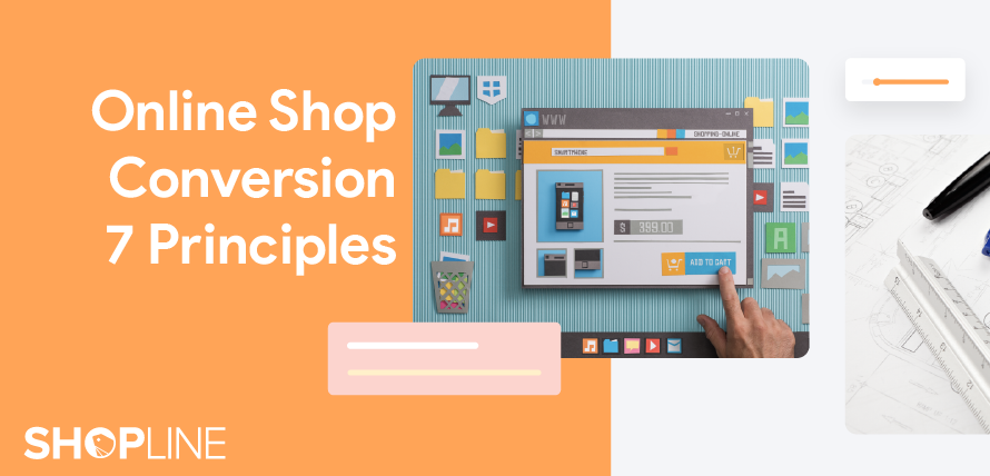
Follow these 7 guidelines to make your e-commerce platform stand out
From the previous example, it is a fact that website design does indeed affect consumers’ willingness to purchase. Furthermore, the website often marks the first impression of the brand. Among everyone else also optimizing their websites, how to make your e-commerce platform stand out is the immediate question.
There is a general direction in website user design, which is to reduce the decision-making fatigue of when browsing. After all, e-shops have sprung up like mushrooms after a spring rain and face increasingly fierce competition over even more divided users’ time and exhausted consumers’ patience. A messy website structure and complex shopping procedures will only hinder sales. Not only that, poor website performance will also affect Google search rankings, as Google has begun to incorporate user experience into search rankings since 2021.
Although Bandier’s model may not be applicable to all businesses, there are still foundational lessons to draw on from this case study. The following 7 principles are for businesses to communicate with website developers before setting up an e-commerce platform:
1. Be Consistent
When designing a website, consistency is critical. From the first page to the last page, content needs to appear to be symmetrical and presented by the same logic, because as consumers click into inconsistent web pages, they may think they have left your website. Hence, a coherent and permanently decided (with low likelihood of future modifications) layout design needs to run from the first to the last page including fonts, colors, the header and footer.
2. Correct Navigation
While you want to provide consumers with the most detailed information, website navigation cannot be overlooked. Whether it is a meaningful icon or a logical hierarchy of the web page, the navigation needs to be successful. The menu should be as concise as possible, and unnecessary social media information can be displayed later. If there is a membership sign-in system, consumers must be guided to log in, so that personalized marketing can be more accurate.
If the navigation design of the website is correct, consumers will be willing to spend more time on the website, and in turn increase the purchase rate. If you find low figures in the conversion rate of your website and the time spent by customers, then it would be wise to review your homepage navigation to identify the related causes.

Figure 2. Optimized website navigation make consumers more willing to stay
3. Use F-Shaped Reading Pattern
Studies found that whenever users visit a website, they follow the “F-Shaped Reading Pattern.” In this mode, the customer’s eyes will first go from top left to the top right and then in the same direction, descend to the next level. Users also tend to look more at the left screen and ignore the content on the right. When we put important information on the left, it helps to increase the conversion rate on the site.
4. The Simpler the Better
Sometimes designers strive for an impressive website embedding visual ingenuities in the design, yet often the end result is only a complex website. There are too many elements in a webpage, which can easily distract users. In contrast, a simple design can make the website more attractive and make it easy for users to find purchase information. When setting up a website, make use of colors, fonts and other elements to keep the overall layout simple but balanced.
5. Responsive Web Design (RWD)
With a growing number of mobile phone users, many e-commerce businesses have seen mobile app sales surpass computer sales, which means that Responsive Web Design is becoming increasingly important. A compatible website can amass the highest traffic from mobile phone users and support social media marketing. If the website is unable to rearrange its layout to fit different mobile phone screen sizes, causing users unable to properly browse online bounce rate surges and loss of consumers may result.
6. Know Your Own Target Audience (TA)
Only by capturing your e-shop’s own TA can you improve your website based on users’ consumption habits and guide visitors to choose appropriate products and purchases. For example, if your products target “professional” consumers, then the product description does not need to be wordy as most of these users are educated and do not have time to be wasted. Similarly, with products marked at lower price points and that are not necessities, we can simplify shopping and purchase to minimise time required for the consumer to consider before purchasing.
7. Simplify the Steps at Checkout
Reducing the steps and time through the checkout process can ensure minimal decision-making fatigue for the consumer. The most cumbersome parts of the checkout process are the “Billing” and “Shipping” information sections. To save the trouble for consumers, we can use Google’s Places API technology to help them autofill in the address in the “Shipping” section. Furthermore, avoid leading checkout to an external platform which may sway consumers away from your platform, and effectively result in a higher bounce rate, consumer time wasted, creating consumer distrust in your platform. Make sure to set clear labels and error messages before the checkout completion stage, so that customers do not abandon the order from not knowing how to deal with operational errors at checkout.
As Sarah Hofstetter, President of Profitero, an e-commerce performance analytics platform, says on the improvement of e-commerce websites, “Like Bandier’s rebranding story, a good website design can help brands stand out among large retailers selling similar products.” If businesses can refer to the above 7 principles in designing their e-commerce websites to provide users a good consumer experience, then the conversion rate and purchase rate will in turn, see boosts, and business opportunities can arise.
|This article is published by FC Future Business Authorized SHOPLINE Academy in Chinese and translated into English. The original title is《想做電商卻在「架站」就卡關?遵循 7 原則打造高成效銷售轉換》|